The World is Your Canvas
EveryART lets individuals create, share, and discover art in their neighborhoods, fostering collaboration, showcasing local talent, and promoting community arts to bring communities together through creativity
Project Background
In 2023, We partnered with YiArt(Non-profit) to work on a mission to facilitate art accessibility and community engagement. EveryART is a product made by a mini team of 4, currently being built with core features.
The Team
Jojo
Product Manager
Duration
5 Months(Nov/ 2022 - Mar/ 2023)
1 / Find Art
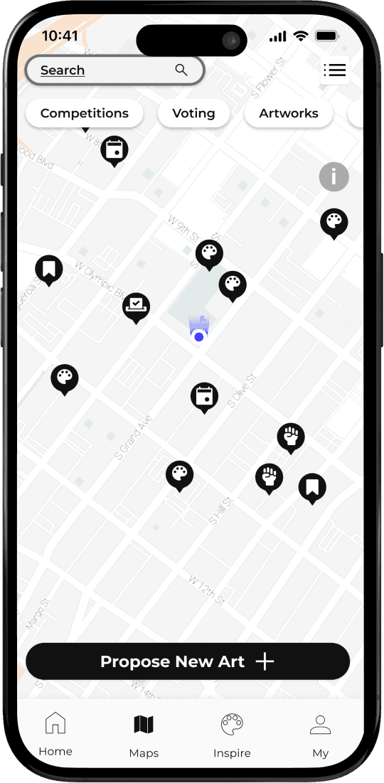
Locate artwork in your very own neighborhood, then get to know about the artist(s) and the creative process. Meanwhile, view virtual artworks created for the same site
2 / Create Art
Propose new art for a place in the neighborhood or join a competition and make your art come to life
3 / Connect through Art
Help decide what artwork go on exhibits by voting; Find art events near you and connect with local artists
Discover
Research, strategize and design an end-to-end digital experience to help art enthusiasts find and create artworks in local neighborhoods.
Research goals & methodologies
Quantitative research / survey
Interview / empathy map
Research findings
My Approach to Research
Adhering to the Double Diamond approach, I executed a research strategy encompassing both qualitative and quantitative methods. The initial phase involved designing the research framework with clear goals and methodologies, aimed at gaining precise insights into user behavior and preferences. This strategic foundation facilitated a thorough understanding of our users, informing purposeful design decisions.
Reseach Goals
1
Identify target audience
2
Identify and analyze user pain points and barriers encountered during the discovery and appreciation of artwork
3
Explore user needs, motivations, and preferences when creating artwork
Methodologies
Survey
Provide valuable quantitative and qualitative data of the target audience
Interviews
We found people who have general interest in viewing and creating art and asked them about their experience searching for art
Behavioral Mapping
Systematically observe and document the behavior of individuals within specific geographic locations
Quantitative Research / Survey
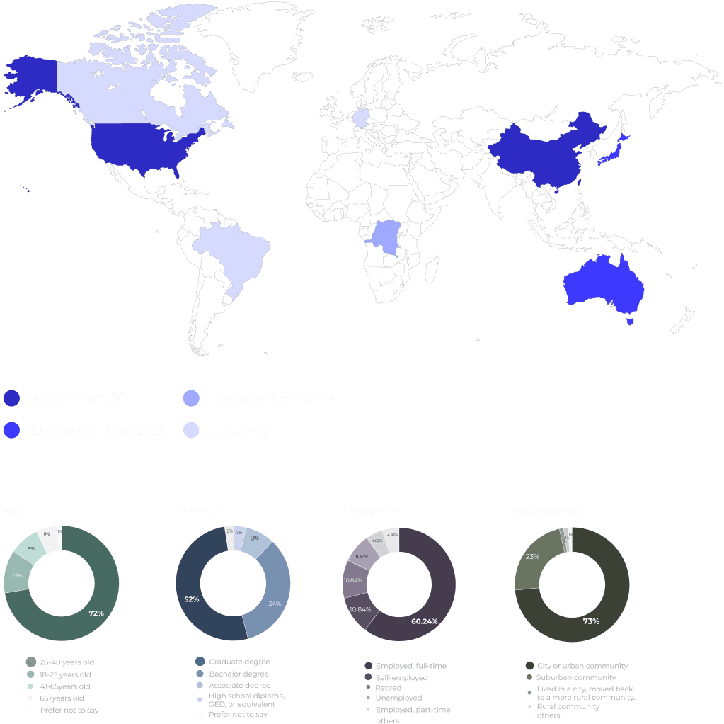
83 participants completed our questionnaire. From them, we selected 9 individuals for additional interviews. The respondents were diverse, representing various locations worldwide, with a significant portion hailing from China and the United States.
Qualitative Research / Interview
We designed the questions around three areas: find, enjoy and social. Based on the interviews, we build empathy maps to visualize our findings


What We Found
1
More Art in Life
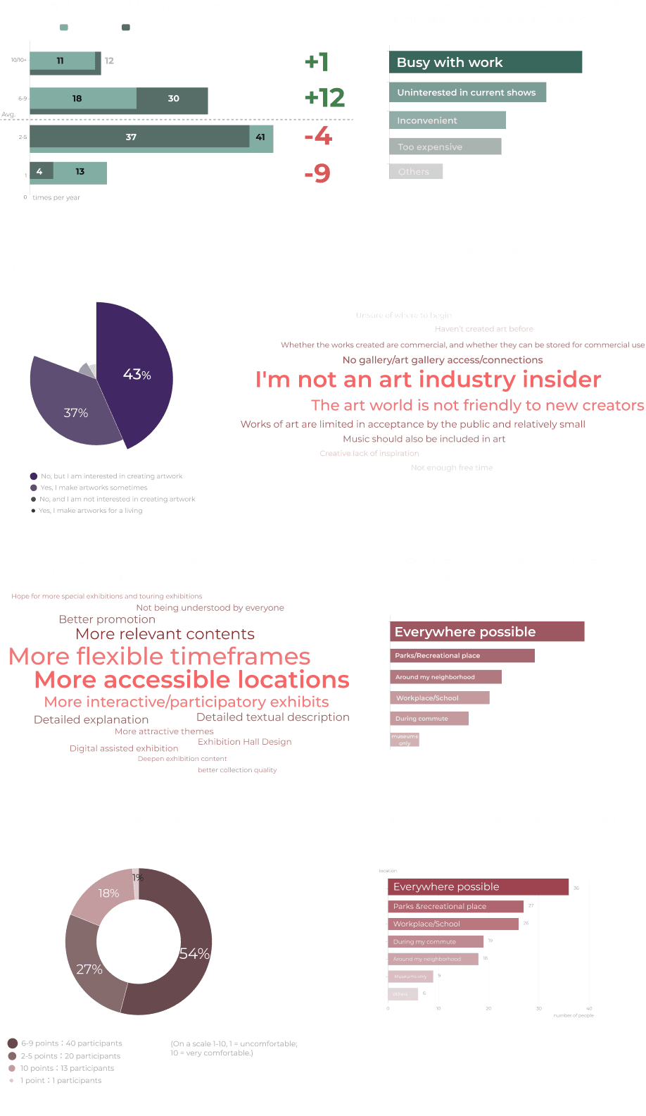
Most participants feel their amount of exposure to art is unsatisfied due to traffic and busy schedules
2
Out of Museums/Galleries
A significant majority of people expressed their willingness to incorporate art into their daily lives, beyond the traditional setting of museums and art galleries.
3
Hard to Create
Many non-professionals want to create art, but face various obstacles such as a lack of experience, guidance, difficulty in obtaining necessary materials, and a lack of platforms to showcase their work.
Define
During the Define phase, our primary objective is to synthesize the findings obtained in the Discover phase. This involves employing techniques like user archetypes and mapping out user journeys to consolidate our insights. Subsequently, we articulate and define the identified problems, culminating in the formulation of a key product hypothesis. This process ensures a focused and strategic approach in addressing user needs and challenges.
Provisional archetypes
User journey mapping
Identify the problem
How might we question
Provisional Archetype 1 / Viewer
The communication with the participants helped me identify the first audience group: art enthusiasts

I love art. I would like to enjoy artworks near me, or just anywhere.
Art viewer
The Art Enthusiast
Goals
Access artworks more easily, during his free time
Feel more engaged with the local community
Frustrations
Not enough time to see all the artworks when visiting museums
Doesn't have easy enough access to artworks
Feels disconnected with others
Viewer journey map
2 / Creator
The second group of users are art creators who wants to get more exposure for their work

I prefer the art that speaks to me than renowned master pieves, no matter where they are shown
Art creator
The passionate art creator
Goals
Create more community-driven artworks
Get more exposure for her work
Feel more engaged with the local community
Frustrations
No accessible platforms to show her work
Unfamiliar with the promotion and distribution in the art industry
Not enough help with creating work that benefits the community
Creator journey map
Problem Statement
Viewers
Most participants feel their amount of exposure to art is unsatisfied due to traffic and busy schedules
Creators
Little access to create or showcase their artworks
How Might We ...
How might we stimulate art creation in neighborhoods so that people can enjoy art nearby?
Ideate
Within the Ideate phase, our emphasis centered on generating solutions that effectively address user problems.
Brainstorming
Competitive audit
Fundamental product hypothesis
Information architecture
User flows
My Approach to Ideation
The objective was to explore a diverse array of ideas during the divergence stage. Following this creative exploration, we conducted a thorough market analysis to evaluate existing solutions, scrutinizing their advantages and disadvantages. Armed with a well-informed understanding of the market landscape, we strategically positioned our service. Subsequently, we formulated a fundamental hypothesis as the basis for developing the service. This foundational approach paved the way for the subsequent phases, where we meticulously designed user flows and information architecture.
Brainstorming
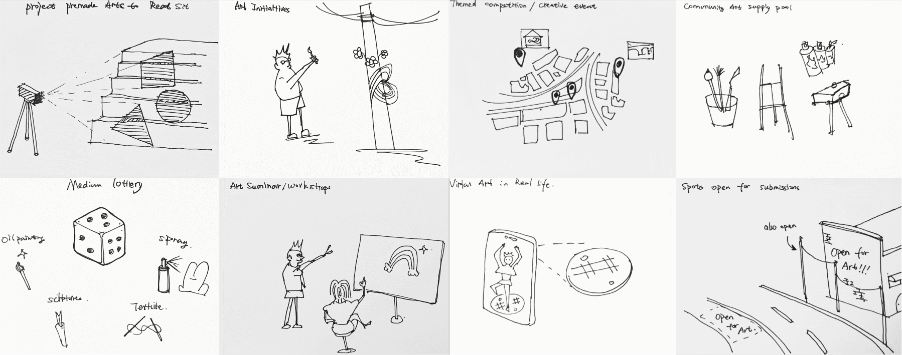
With the HMW question in mind, we explored a wide range of ideas without limitation
Competitive audit
We chose 10 apps currently on the market that are addressing the two key problems stated above So that we can:

Empower non-professional people create public art

Connect communities through art creation

The Hypothesis
Information Architecture
With the growth model in mind, the information architecture become clear

1 / Discover art and art events in the neighborhood
2 / Create art with the community
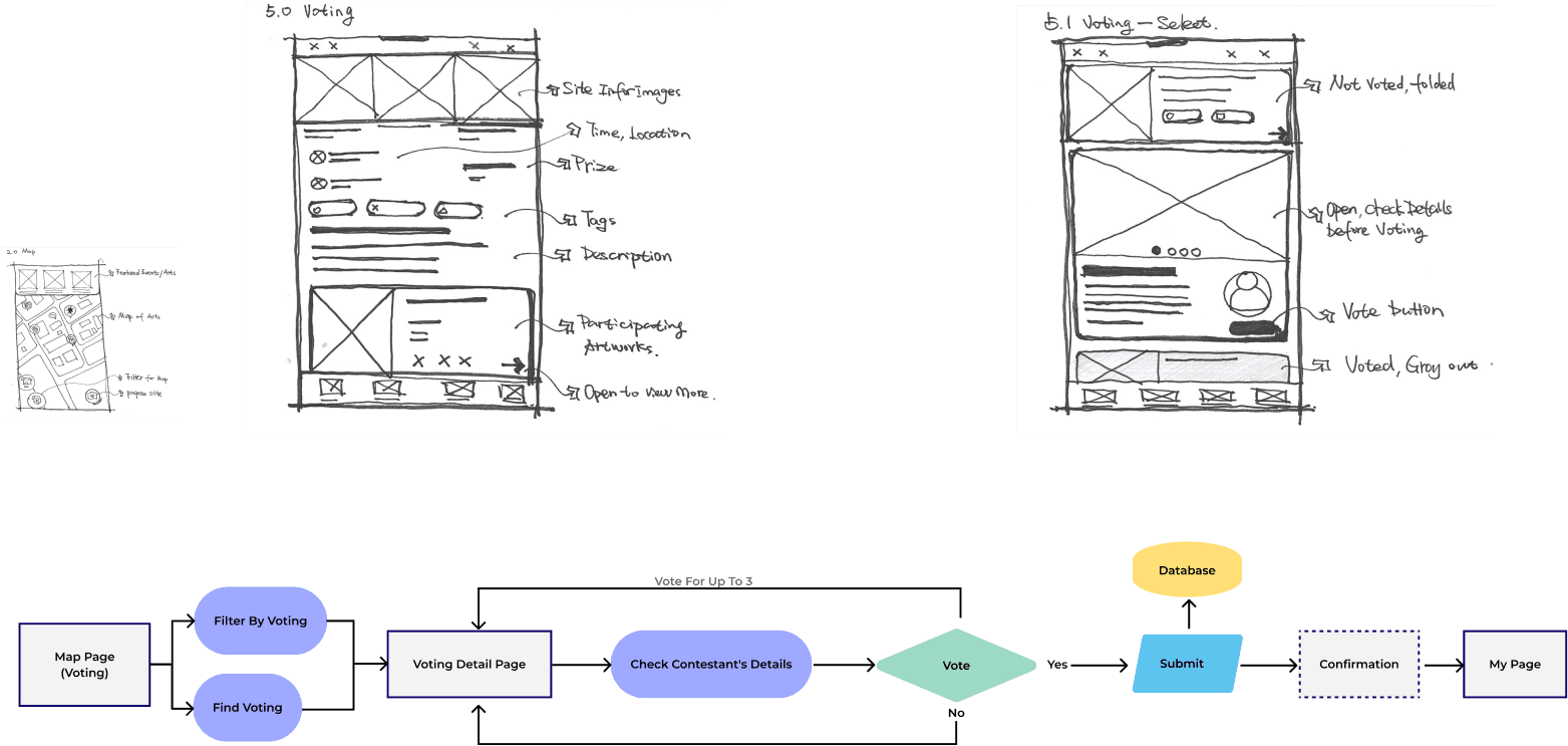
3 / Engage in the art screening process by voting
Prototype
Wireframing
User testing round 1
Design uodates
Style guide / Design systems
User testing round 2
Refined design
My Approach to Prototyping/ Deliver
The methodology revolved around iterative refinement, continually seeking improved solutions through design testing. We initiated the process with wireframing and low-fidelity prototypes, conducting the first round of testing to gather valuable insights. We then divided the team into visual/UI design and flow/UX design groups. This division allowed us to refine the low-fidelity design, incorporating the newly adopted design system. Following this integration, we conducted further testing, refining the design iteratively based on user feedback. This cyclical approach ensured that each iteration brought us closer to an optimal and user-centric design solution.
Lo-fi Prototyping
This fast exercise helped the team visualized the possible screens, they bring the flows to live and up to team critiques

Testing Round 1
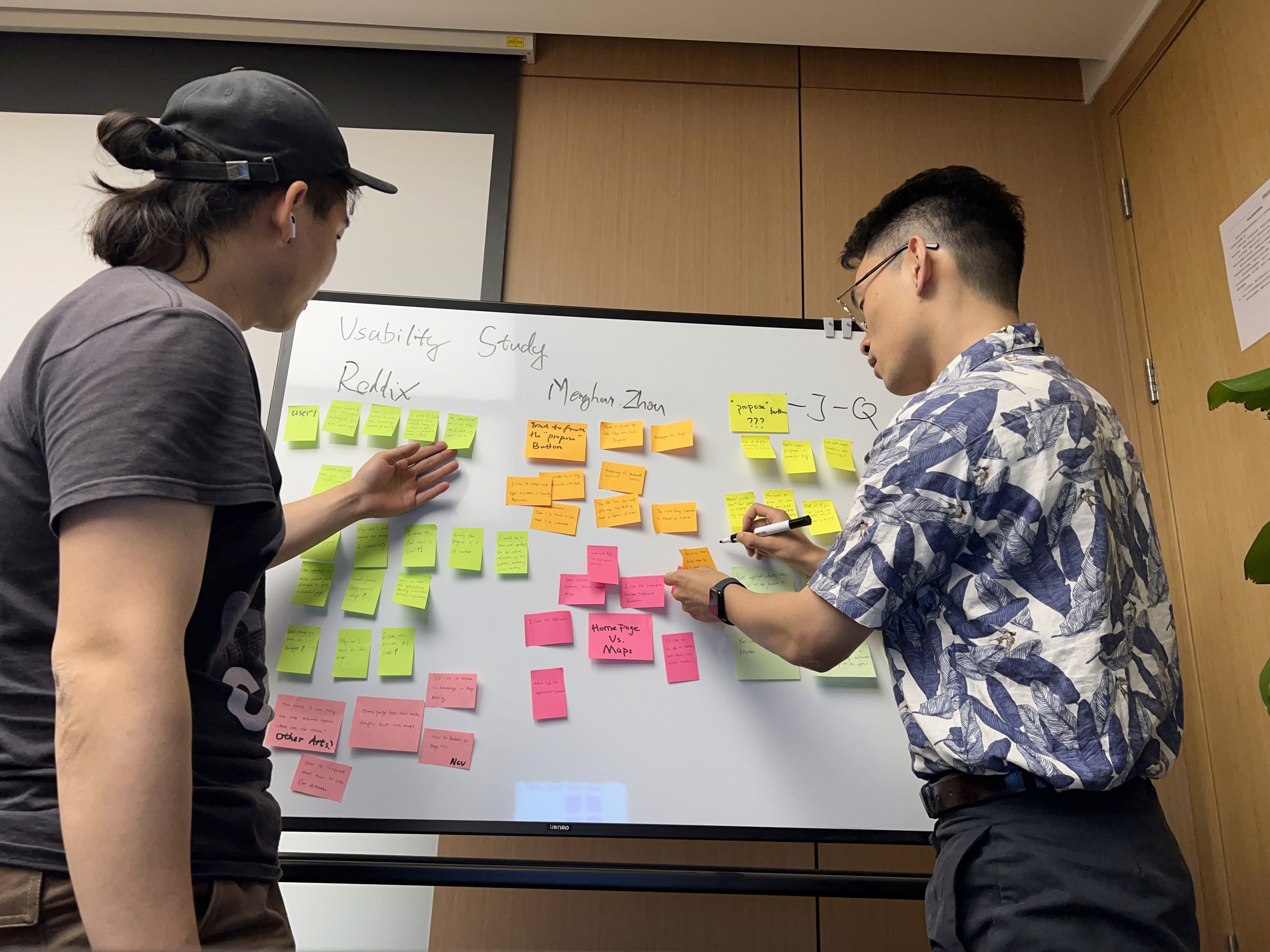
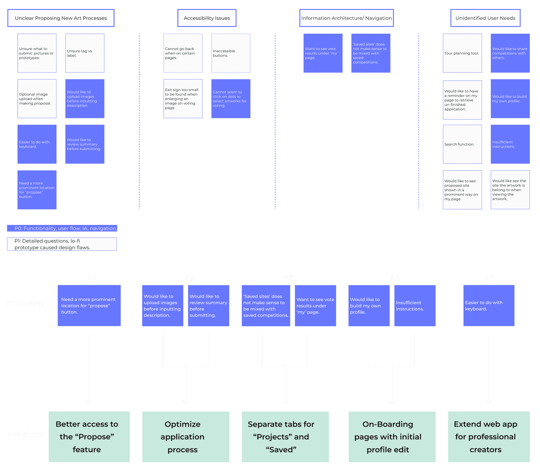
Immediately after the first round of lo-fi design, we conducted a usability study with 5 users. I focused on the app's major functionalities, and found 5 areas to improve.
Design Updates
Informed by the usability studies, we updated the design in the following areas
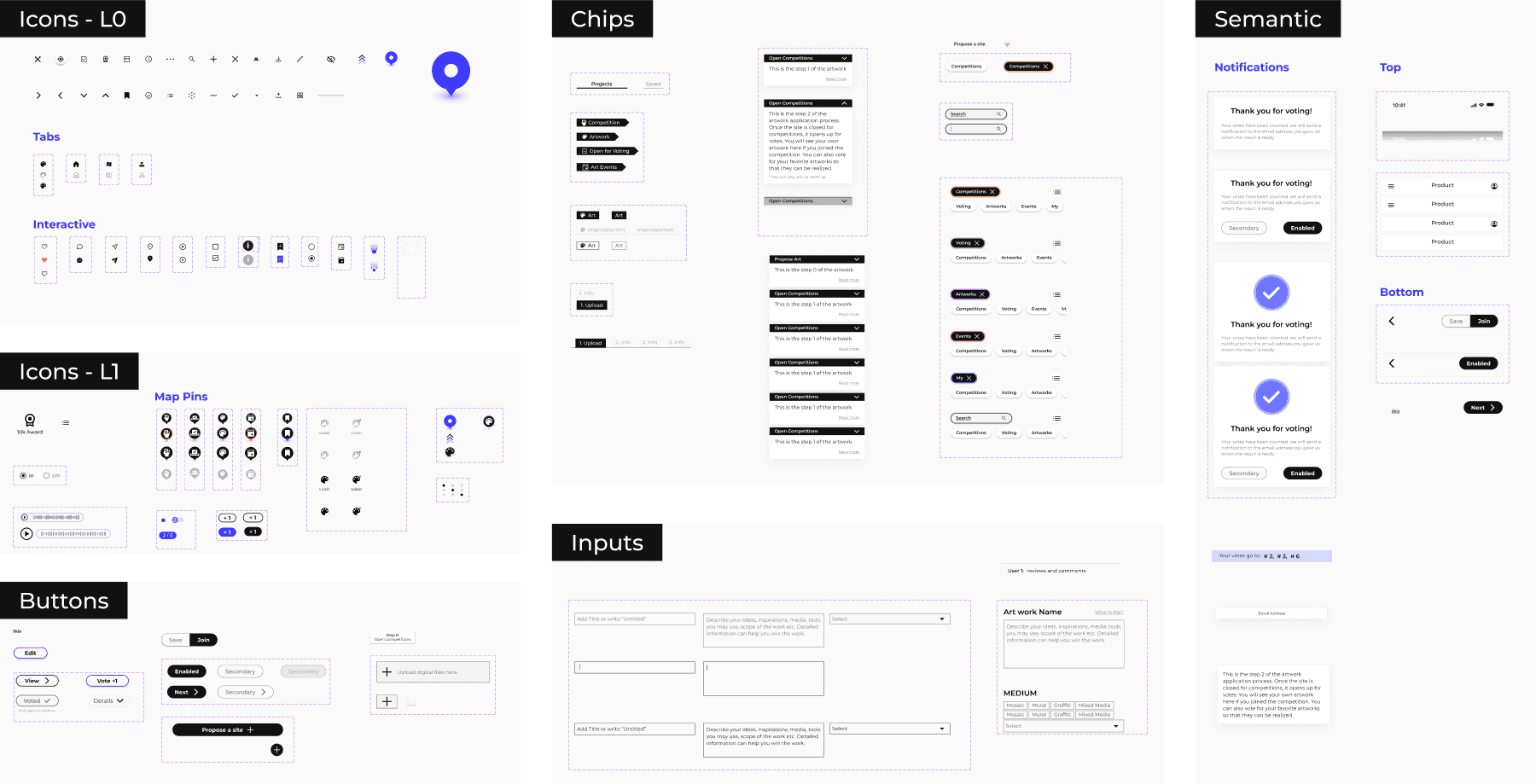
Style Guide / Design Systems
Given the content-heavy nature of our product, we prioritized a simple, high-contrast style guide to prevent UI interference with artwork images. This guide was seamlessly integrated into our design system, ensuring consistency and efficiency in user interface elements.

Testing Round 2
Intergrated the design systems and user feedback, we used the new design to test a wider range of usability issues and found 5 themes to prioritize


Refined Design
Here are the improved areas before the "final" design
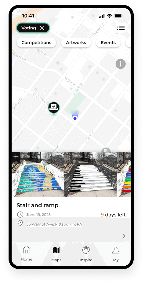
Find art and events nearby
Filter by event type
Preview on map
Detailed page
Learn about the art by
Listen to the artist talk
Explore how it was made
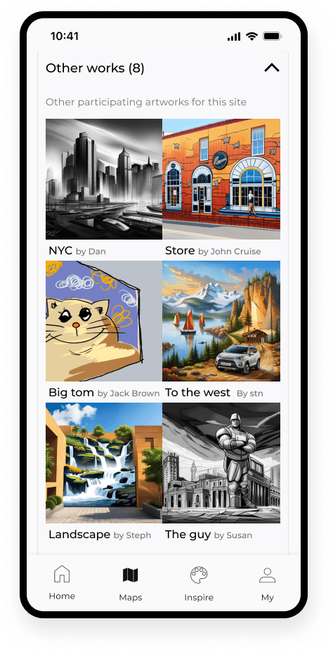
Consider other proposals


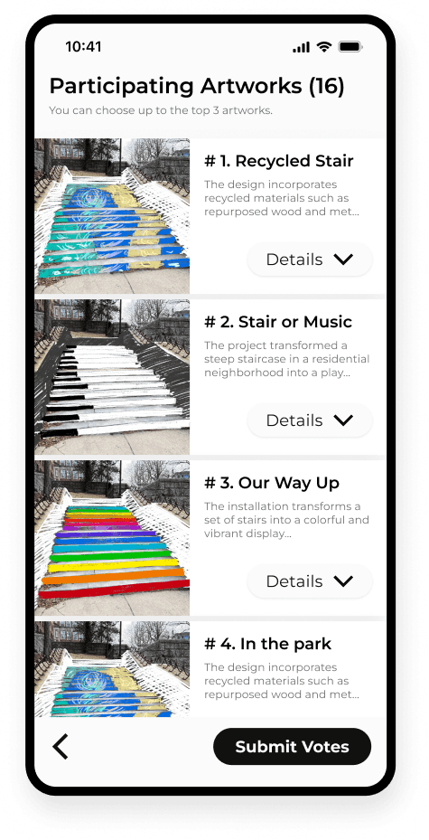
Engage in the selection
Receive community invitation to vote
Choose your top 3
Get notified of the result
Enjoy the art you help select
Reflect
63 Meetings: A Symphony Of Dedication And Collaboration
In a remarkable display of commitment, our team harmoniously convened for 63 meetings over a span of six months. Despite the challenging obstacle of a 12-13 hour time difference and the demands of life, our unwavering passion and endurance shone through, propelling us towards our collective achievement
The Power Of Research And User-Designer Interaction
The realm of user experience research (UXR) never fails to astound me as a designer. Engaging in research allows me to pose meaningful questions and receive invaluable feedback directly from users. This direct interaction between users and designers has emerged as the foundation of my design process, enabling me to create more impactful and user-centered designs.
Engaging Stakeholders In The Design Process
Drawing from my experience as a designer, I have come to recognize the pivotal role that clients play in shaping the final product. This project focused on users and social good, the emphasis primarily lies on addressing user needs.

