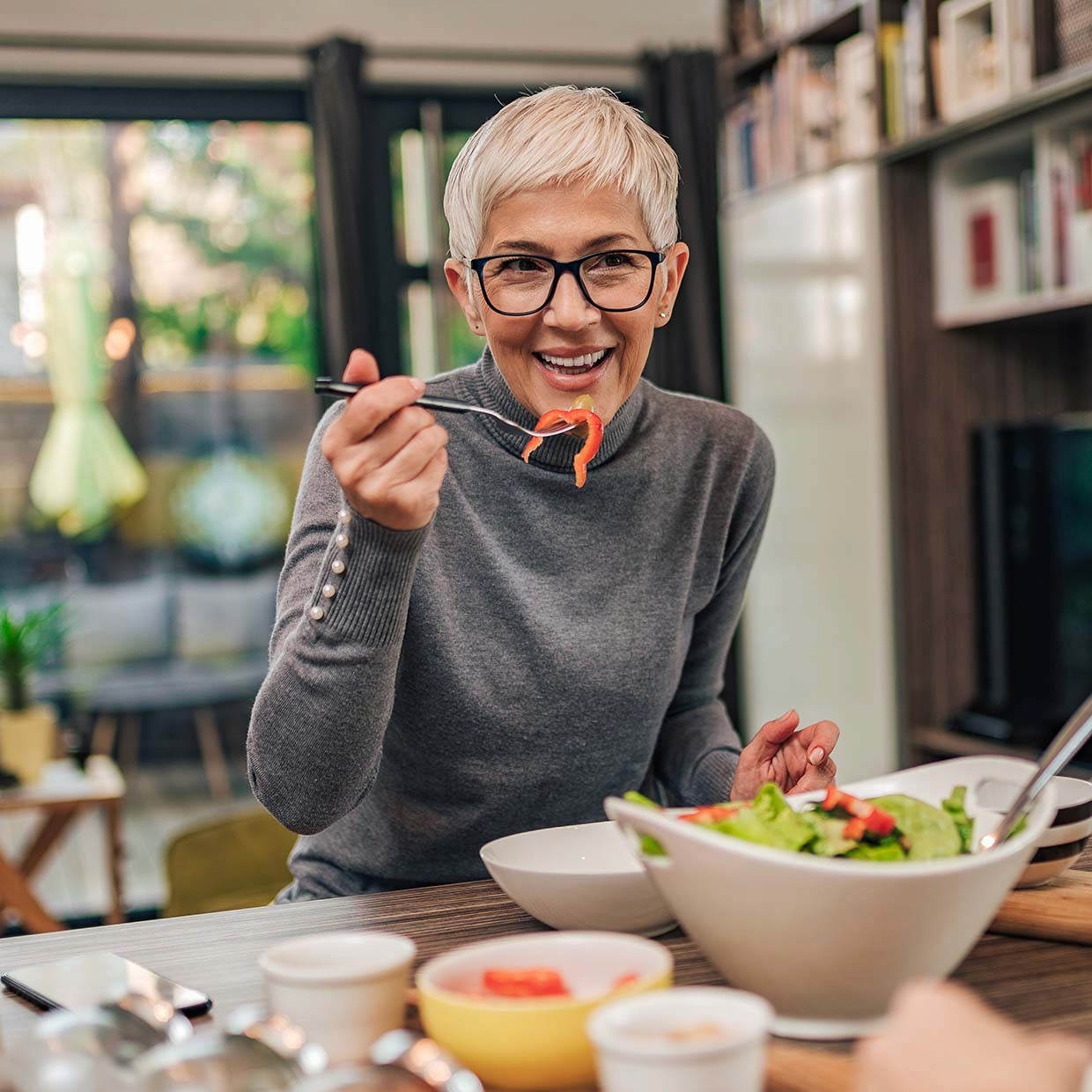
Finally, food speaks your language
An AI powered personal food library that helps users discover new dishes and expand their palettes safely through easy identification and classification of unfamiliar ingredients.
The Background
Ingredify, an AI-powered personal food library, is a startup project I co-founded with another engineer. The team expanded to more designer, engineers and strategic advisers, we've navigated two design phases. Currently in the code review stage, we're actively shaping both business and design strategies, showcasing our team's agility and collaborative prowess
The Team
Zane
Product Designer, Team lead

Effie
UX Designer

Jordan
Backend Engineer
Danny
Frontend Engineer
Duration
Phase 1: 3 Months(Sep/ 2021 - Dec/ 2021)
Phase 2: 3 Months(May/ 2023 - Aug/ 2023)
1 / Visualize The Menus Through Your Lens
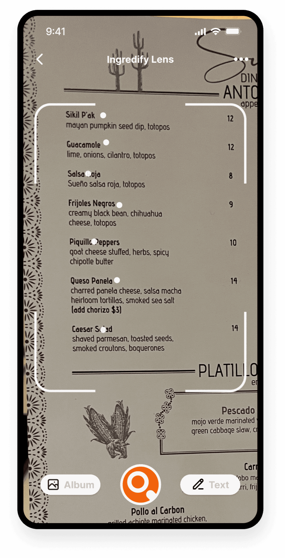
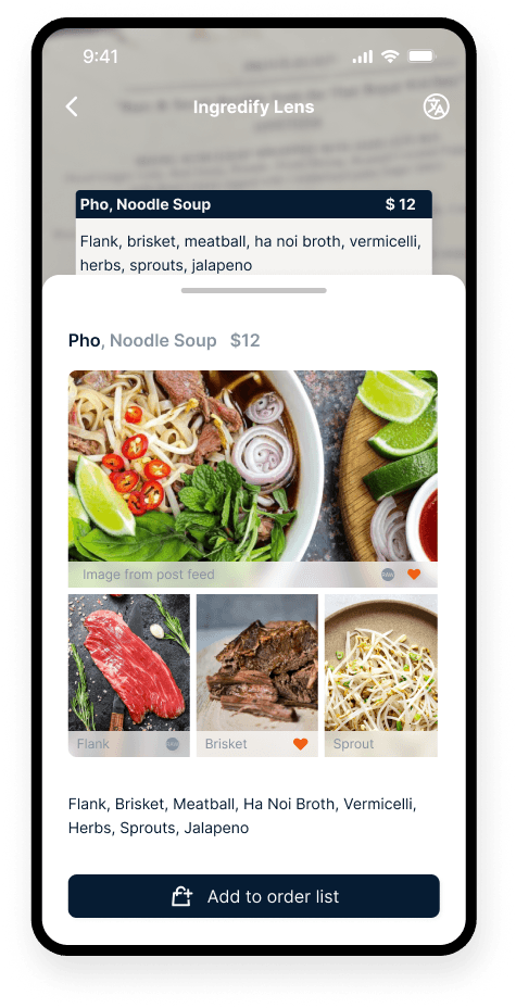
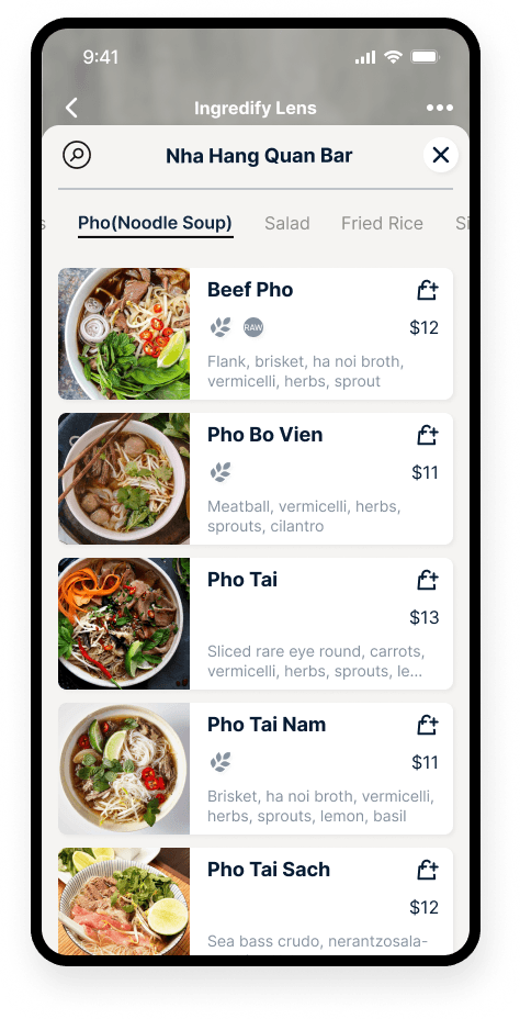
Take a picture of the text-based menu, Ingredify will create a gallery of ingredients, reflecting your food preferences
2 / Build A Personal Food Library
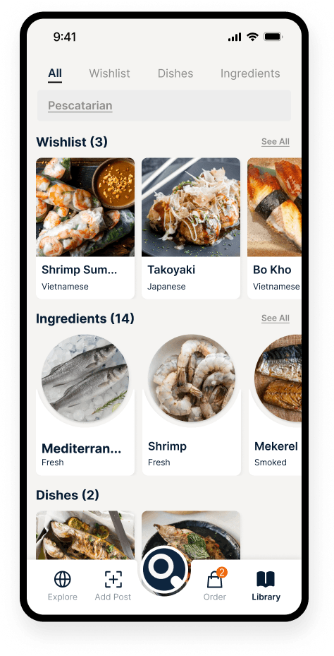
Every new dish and its ingredients will enrich your food library, becoming a guide for future culinary adventures
3 / Share The Deliciousness
Expand your food library both through your own taste buds and friends’ fun nights out
My Approach to Research
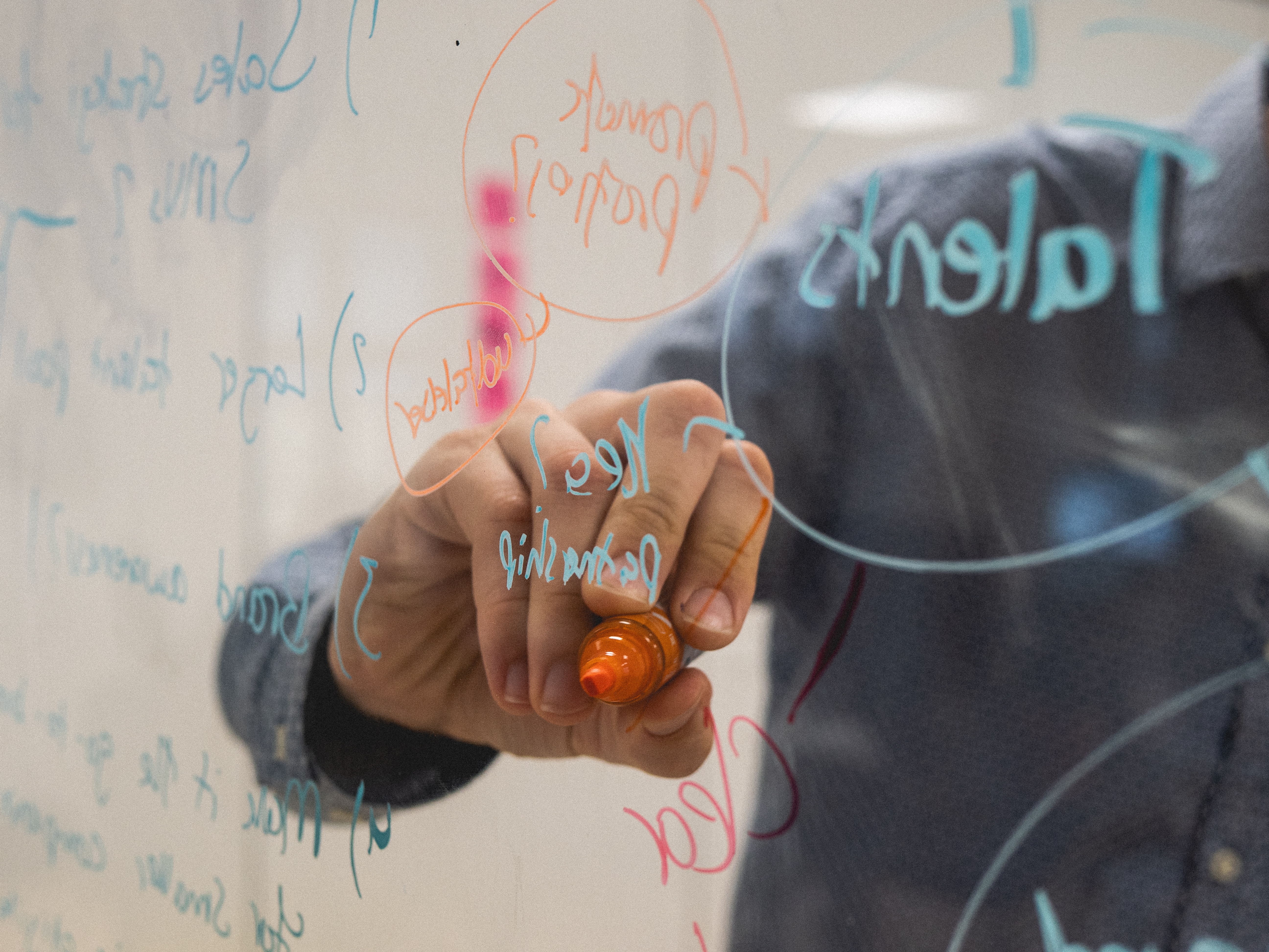
In the discovery phase of my UX design case study, I followed the Lean UX Canvas approach and conducted both qualitative and quantitative researches. To empathize with users, I treated a group of friends as rewards while asking them questions about their dining experience. Additionally, I conducted market research with restaurants and customer research with restaurant customers.
Interviews
I Interviewed with 5 participants at a dinner party and 4 over zoom, aiming to understand their common challenges and frustrations when ordering food with text-based menus.
Empathy Map
Based on the interview findings, I observed what they say, think, do and feel during the process and built empathy maps for each of the interviewees.
Provisional Persona
The communication with the participants helped me identify my target audience: People who are interested in exploring more food options and those who have food restrictions. Everything at this point has been my best assumption to be varified, so I created the following two provisional personas, they growed as we found more in the following design thinking process.
User Journey
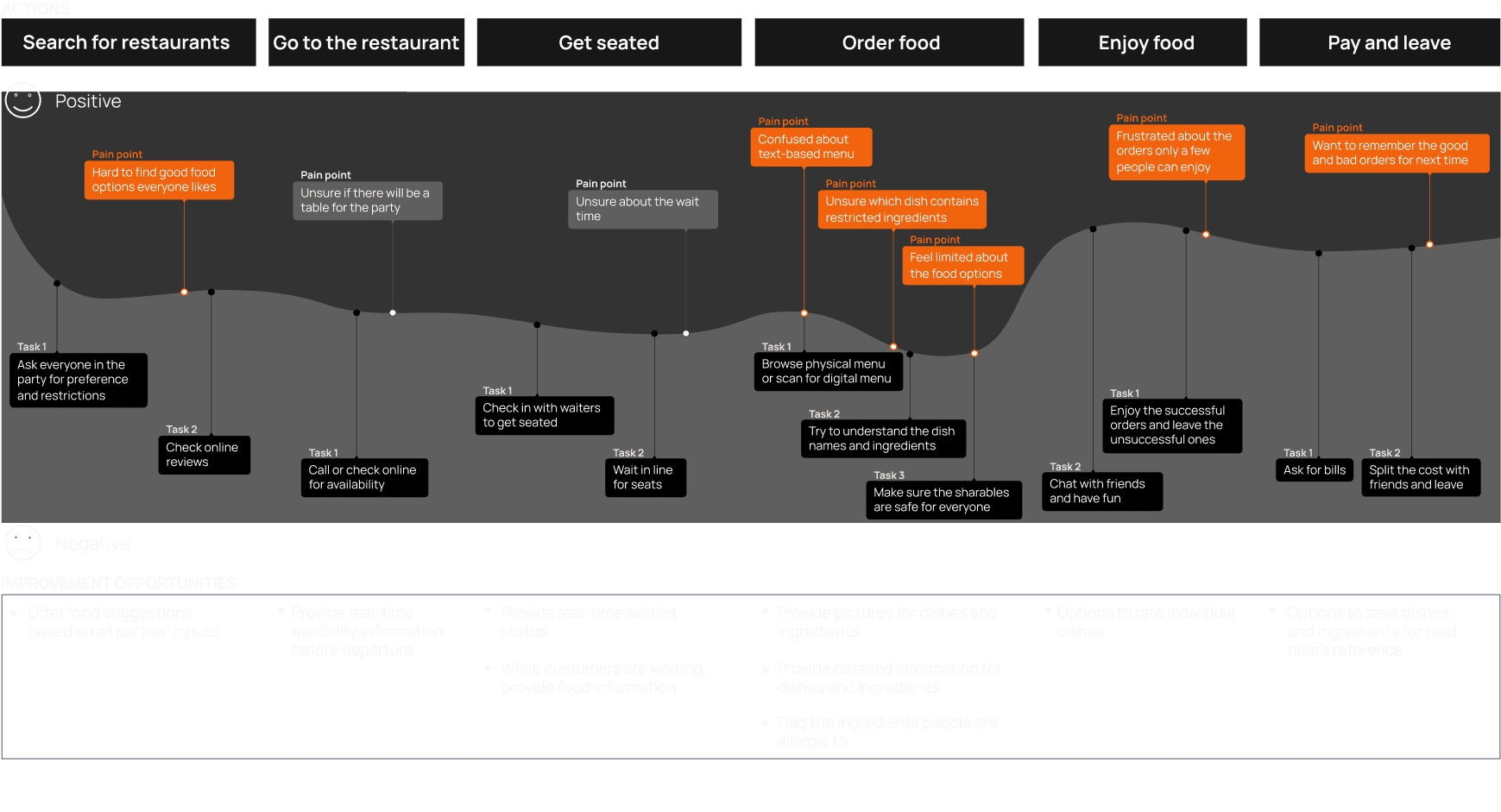
To understand the personas, user journey maps was indentified as the best canvas of their actions, task lists, feeling adjectives, and possible improvement opportunities. Here is Alex's journey
Identify Pain Points
Almong all the painpoints along the user journeys, we identified the following 3 as the most pressing and within scope of services.
1
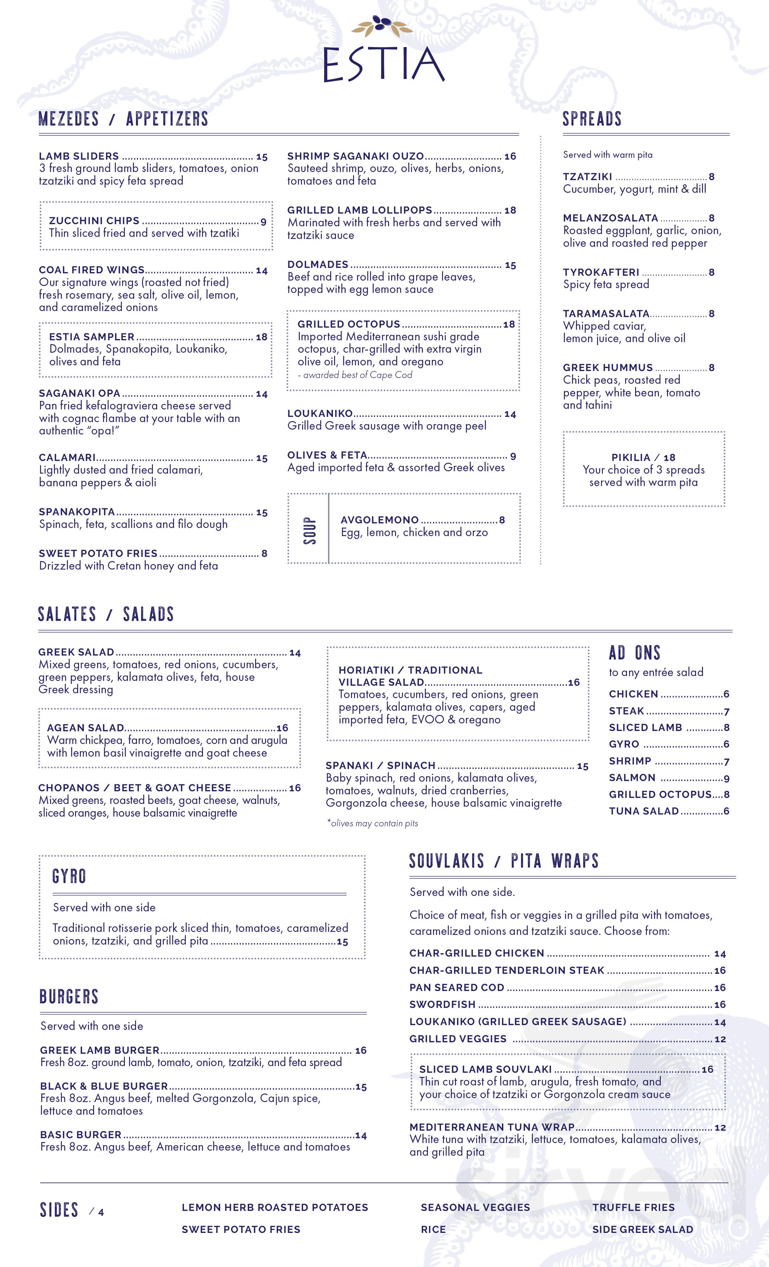
Text-heavy
Text based menus don't provide enough information to help order food
2
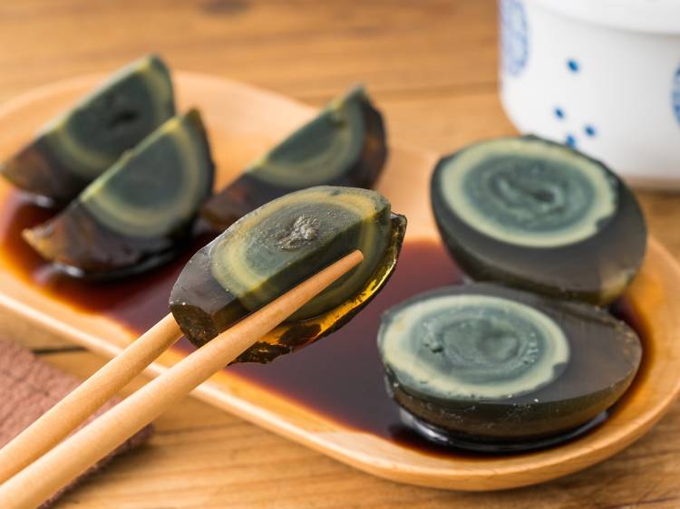
Unfaimilarity
Unfamiliar ingredients are a major obstacle for customers to try new dishes

3
Food Restrictions
People with dietary restrictions don’t have convenient ways to order safe and enjoyable food at restaurants
The Hypothesis
How Might We ...
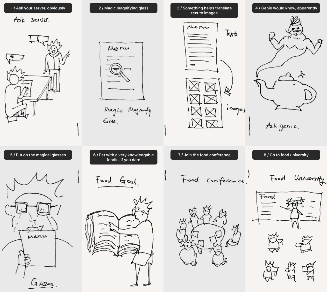
Crazy 8s
To learn about existing solutions, I conducted a competitive repository. It helped me select and priotize the ideas from previous rounds of ideation
Competitive Analysis
To learn about existing solutions, I conducted a competitive repository. It helped me select and priotize the ideas from previous rounds of ideation

Value Proposition
I want to design the app Ingredify to help users make decisions when ordering food by providing information about multiple ingredients visually and simultaneously. It will further enable restaurant customers to explore and enjoy more dishes safely

Simultaneous results
All the ingredients are presented at the same time

Informed decision
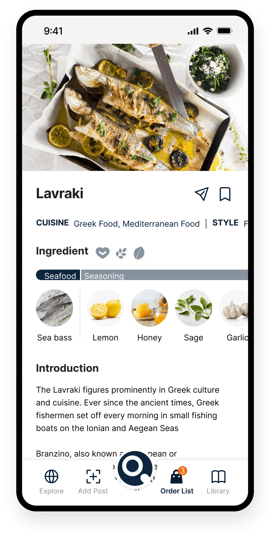
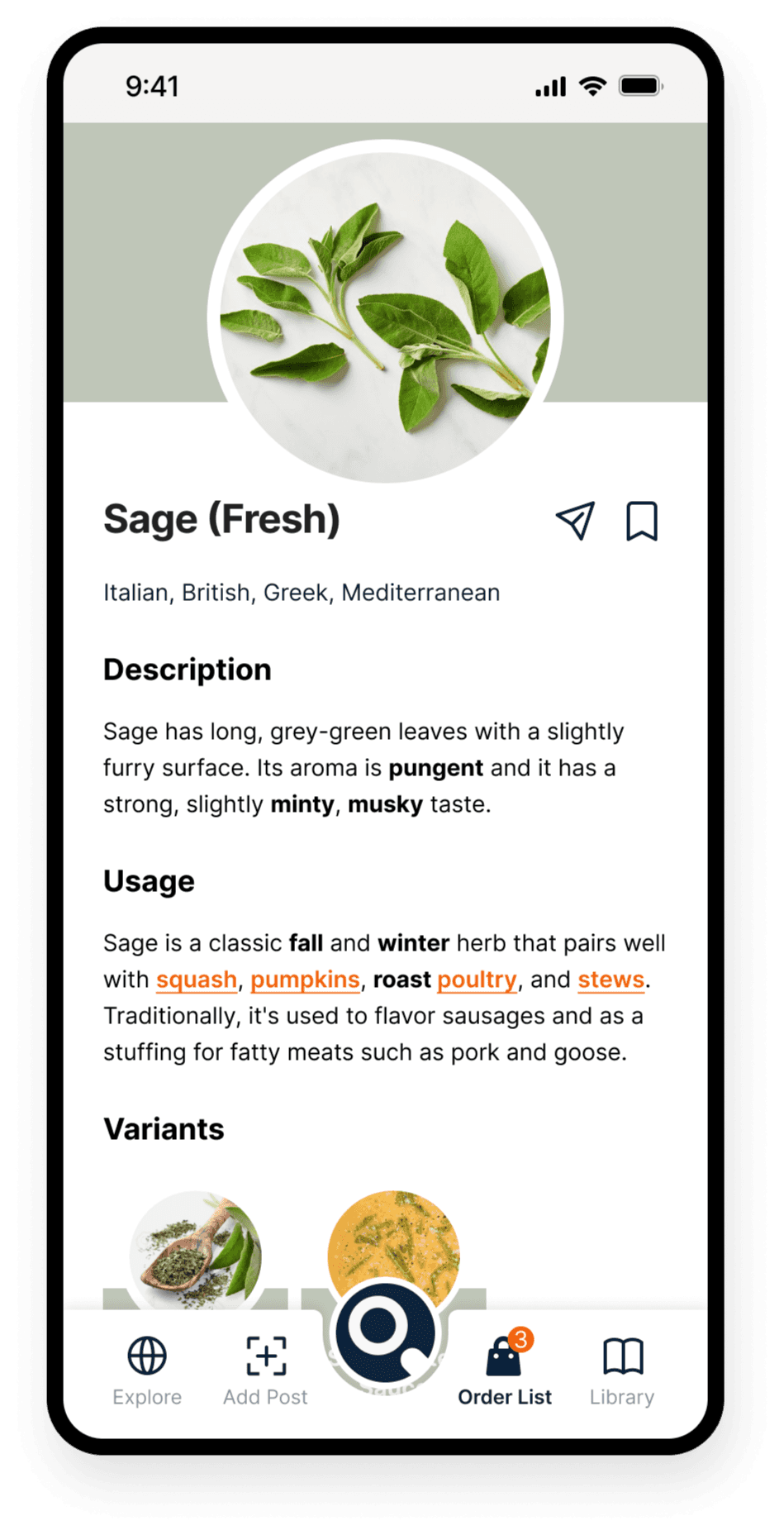
The app informs the users with images, facts and backgrounds of the dishes and ingredients to make the food ordering easy

Personalized food library
Users can mark dishes and ingredients and build a personal library of food

Expand comfort zones
The app helps users expand their food comfort zones and improve their confidence levels when they explore new food
The Model
Before diving into user flows, I buit a model of interconnected and mutually promoting features of Ingredify, it further evolves into the information architecture of the app

Information Architecture
With the growth model in mind, the information architecture become clear

User Flows
1 / Search Dishes At A Restaurant.

2 / Build A Personal Food Library

3 / Explore, Save And Share Dishes

Wireframe
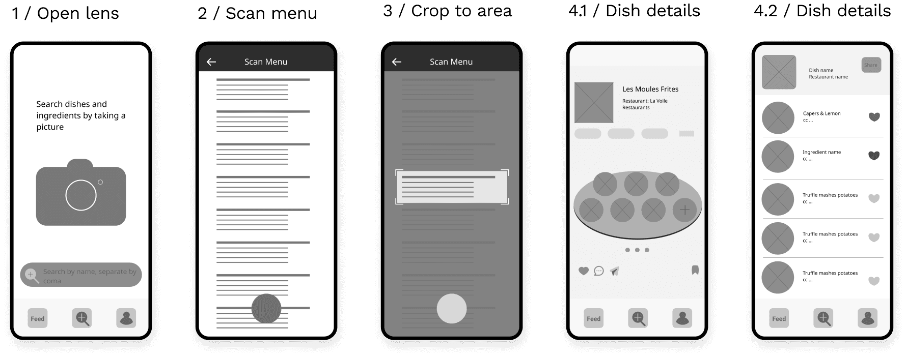
Playing with pen and paper allows me to quickly visualize the ideas and keyframes forming in my mind. I then moved on to a physical prototype and tested it with users

I used figma to quickly develop a set of digital lo-fi prototype to test out the foundamental user flows
Testing
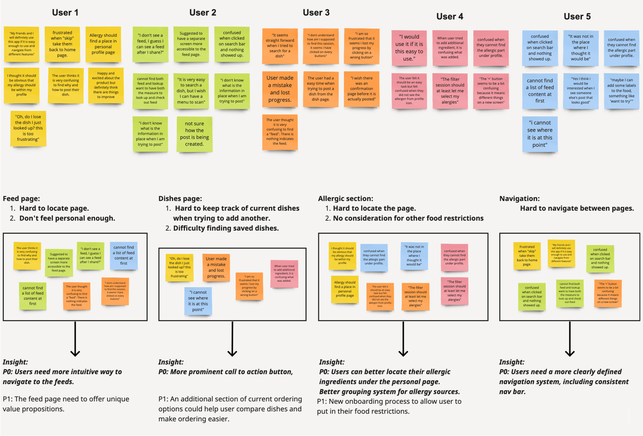
Immediately after the first round of lo-fi design I conducted a usability study with 5 users. I focused on the app's major functionalities, and found 4 areas to improve.
Design Mockups
Ingredify was realized as a hi-fi mockup for the first time after absorbing the prioritized user insights.
1 / Search Dishes At A Restaurant

2 / Build A Personal Food Library

3 / Explore, Save And Share Dishes

Testing Round 2
After realizing the hi-fi mockup, there are way more areas to test design, usability and interactions. I carried out another usability study involving 8 participants, among whom I found a partner, Effie, to join me for a new iteration of design
Problems
Feed page doesn't feel personal enough
Hard to find the seasonal and local ingredients section
Imposable to search ingredients from one's own library
Lengthy search processes, lost previous progress when starting new search
Hard to navigate across features
UI elements are too busy
Solutions
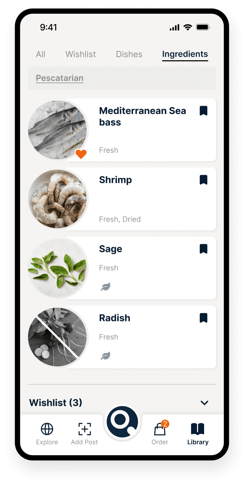
Items reflect on user's personal food library. Unfold enabled ingredients bar under dishes.
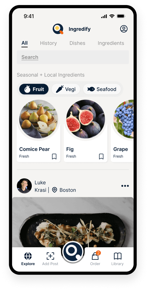
New home page structure, moved seasonal and local ingredients to the top of homepage
Added internal search feature
New search process
Add current order feature
Redesigned centralized navigation
Increased spacing, limited color usage, better contract
Selected Refined Design Areas
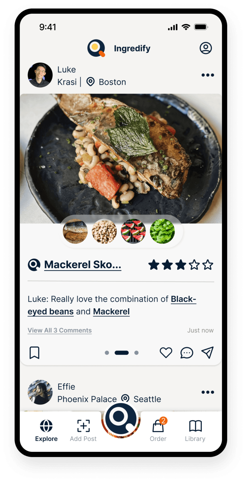
Here are the improved areas and the "final" design
Before
After
Selected Final User Flows
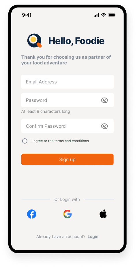
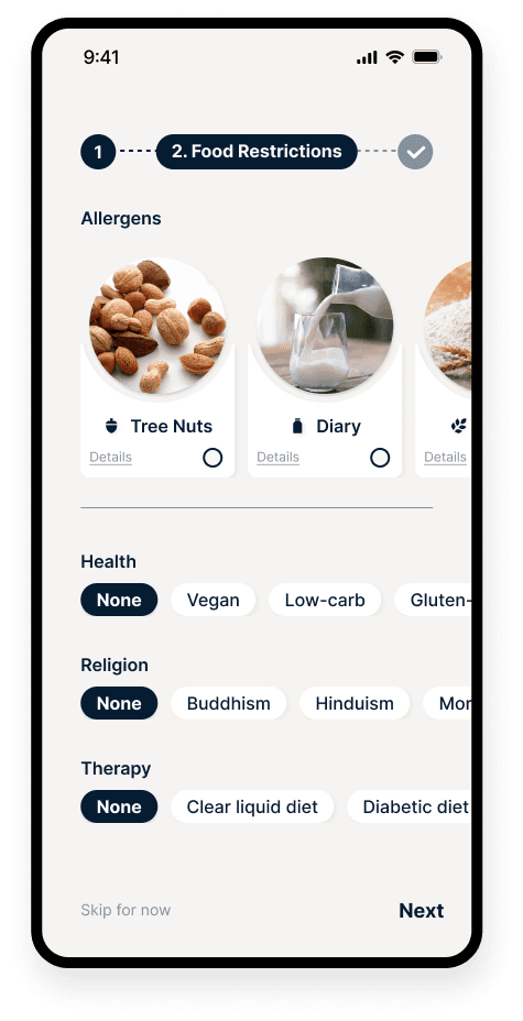
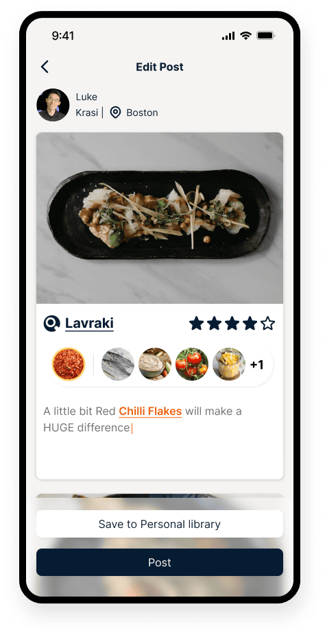
Onboarding
Welcome animation
Input dietary restrictions
Start exploring
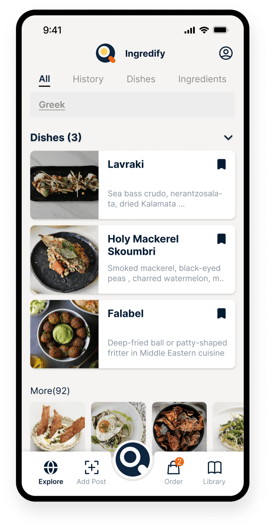
Search
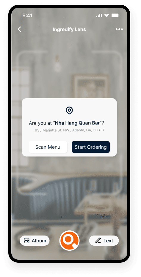
Locate restaurant
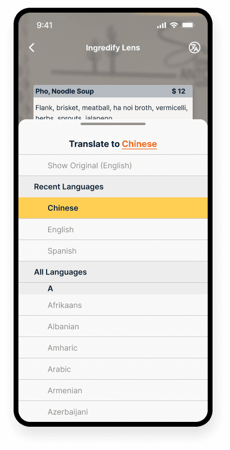
Scan the menu
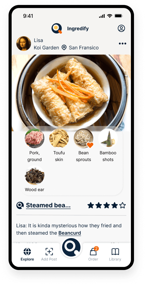
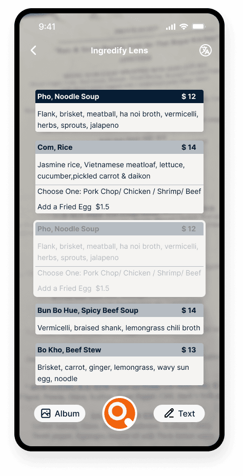
Visualize ingredients
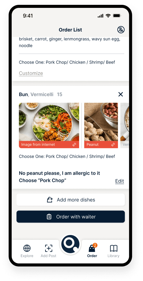
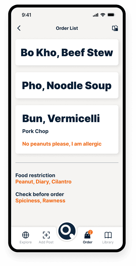
Order with ease
Build
Auto add after order
Get inspired
Expand
Order again

Reflect
Working with cross-functional teams
Engineering, product, and business owners, helped me to avoid scope creep and gain insights from different perspectives. The business owners provided feedback on the business needs, while the engineers provided technical insights and it often helped me make better design decisions. The collaboration helped me to design a product that was user-centric and aligned with the business goals.
Navigate uncertainties
There is nothing certain about a startup, sometimes it feels like you can either do nothong or do something wrong, because the feedback loop is still being built. I learned to navigate these uncertainties and be agile and flexible and push product towards the right direction.
grow alongside customers
As the product grows, knowing what they think and feel always gives invaluable feedback and directions. By conducting qualitative and quantitative researches, I was able to understand the users’ needs, preferences, and behaviors. This helped me to design a product that was tailored to their needs and preferences.
Design thinking the startup
Too many ways to approach startups, I found the Design thinking, double diamonds, Lean canvas methodologies extremely helpful when we want to push the product forward. They provide a school of thinking when facing uncertainties and challenges.


